THE LOGO STUDY: When a Mark learns to speak
There is a certain quiet violence in a logo when it is handled correctly.
Not loud. Not desperate. Not begging for the eye. But present with enough authority to hold the garment in place, to turn cotton into language, to make a T-shirt feel less like merchandise and more like a framed object that learned how to move.
For PHILLIP&FINNELL, the logo is not treated as a flat identifier. It is not simply placed on the shirt to announce the brand. It is built into the atmosphere of the piece. The mark becomes architectural. It becomes coded. It becomes a visual accent with its own dialect.
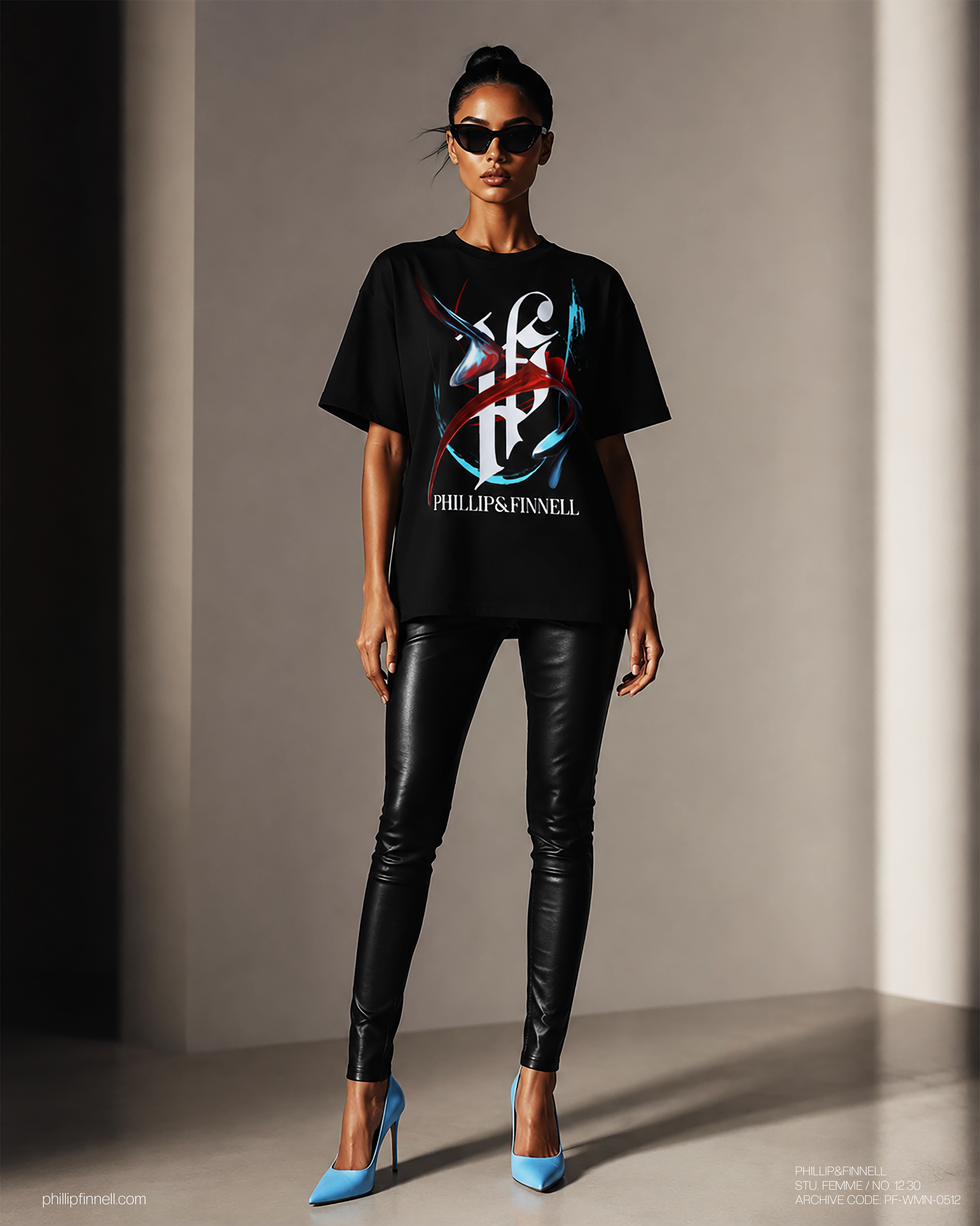
In this study, the monogram sits beneath layers of abstract movement, red and ice-blue strokes cutting across the surface with a controlled unrest. The graphic does not decorate the logo. It converses with it. The abstraction wraps around the letterforms, interrupting them just enough to create tension, but never enough to destroy their clarity. That balance is where the garment begins to feel expensive.
The logo speaks one language: structure, identity, permanence.
The artwork speaks another: motion, emotion, fracture, instinct.
Together, they create a third language. Something colder. More editorial. More private.
This is where the PHILLIP&FINNELL visual world becomes distinct. The brand mark is not used like a stamp. It is treated like a gallery symbol, something that can be studied, obscured, revealed, and reinterpreted. The abstract art becomes intertwined with the logo in a way that makes the viewer look twice. At first glance, it reads as a clean luxury graphic. On the second glance, the surface opens up. The brush movement, the sharp color, the negative space, the serif letterforms, they all begin to operate like separate instruments inside the same composition.
The black garment becomes the gallery wall.
The body becomes the exhibition space.
The logo becomes the artifact.
There is also a restraint here that matters. The piece does not collapse into chaos. The red stroke gives heat. The blue gives distance. The white monogram gives discipline. Every element is held inside a controlled visual climate, allowing the shirt to feel expressive without becoming noisy. That is the line PHILLIP&FINNELL continues to study: how to make something feel artistic without making it feel overworked.
In an era where logos are often enlarged until they lose all mystery, this design moves differently. It lets the mark breathe inside abstraction. It lets the artwork carry emotion while the logo carries authority. The result is not a graphic tee in the traditional sense. It is a logo study. A wearable composition. A coded object from a brand still defining its own visual alphabet.
PHILLIP&FINNELL does not use logos to simply be recognized.
It uses them to speak.